ABSTRACT
ConnectRN is a clinical staffing company that uses a phone app to direct clinicians to shifts, while managing those shifts via a desktop webapp. I was asked to design a new in-app payment experience - eventually labeled "Pay+". During this project I worked closely with Matt Whiffen, a ConnectRN project manager.
This case study will walk through the process of design, from first signals to initial launch.

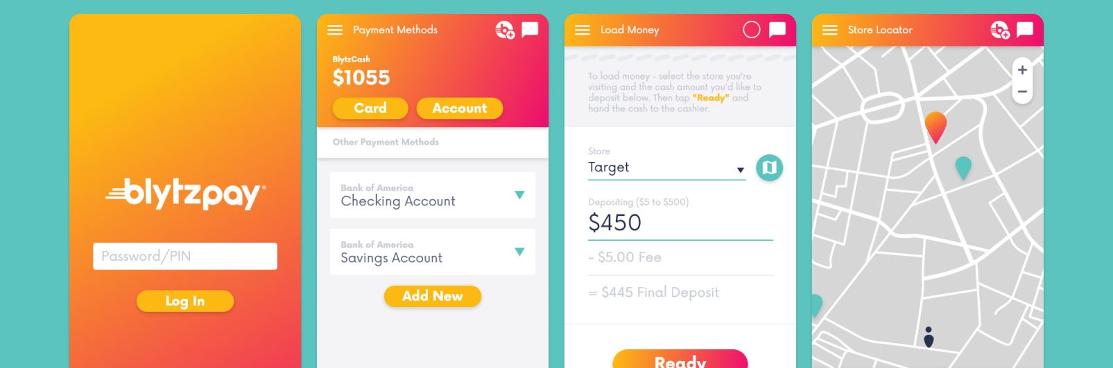
Our banking feature, contained within the larger ConnectRN application.

THE INITIAL SIGNALS
Part of ConnectRN's general research strategy was a recurring "NPS Survey", in which highly active clinicians were invited to give feedback on the company's performance. After one such quarterly survey, I categorized the feedback along with the rest of the Design team - and we noticed a high incidence of "speed to pay" complaints.
Around the same time, we were conducting generalized clinician interviews within the company. We wanted to get a better understanding of different clinician personas. Two interviewees gave us very different ideas of their approach to the application.
Sarah
As a working nurse, Sarah had a very "day by day" approach to her work. Checking ConnectRN was part of her morning routine. She would get up, check for shifts in her area available that day, select one or two she could get to, and then build her day around that schedule.
Her priority was immediate work and immediate reward - so the weekly payroll disbursements could cause real problems for grocery shopping or other important purchases.
Rashad
As a student, Rashad was very goal-oriented with his usage of the application. He saw ConnectRN as a way to earn money while on break, and save up for particular purchases. His eyes were currently on a luxury watch, and he had already booked about twenty shifts, to start in a few months, when we spoke to him.
His priority was planning and saving - so immediate payments weren't very useful for him at all.
Conclusions
Based on the NPS survey and the interviews, Matt and I saw that a new payment method was necessary. Clinicians like Sarah needed a way to access their payment for a shift within the same day.
Matt was very keen to do this within our application itself. Keeping our users inside of a singular ecosystem would let us accelerate their paycheck, directly celebrate their successes, and perhaps even help them plan for the future.
Of course, building a banking system is a pretty big ask. So we began the hunt for an integration partner.
Integration
Matt arranged several interviews with multiple potential partners. These interviews further shaped our project (now named Pay+), as we discovered what was possible in this "banking services" space. Two interviews stood out in particular:
Branch
Branch banking offered the direct payments we needed, and with no requirement to "load" those funds to Branch ahead of time. That would be useful, given the often strange financial situations a growing startup can land in.
However, Branch required the use of a secondary application. While it was well designed, I still felt that the second login was a dealbreaker. Many of our clinicians were over forty years old. I felt that asking them to manage a second application was too much - it would definitely reduce the adoption of this new feature.
Unit
Unit's approach was to provide banking services via an API and partnership with a bank. Unit would take on the financial liabilities, while making funds accessible via their app or via our own. 
Showing earnings and allowing transfers from inside the ConnectRN app was very exciting - having everything in one place would be more convenient for our users.

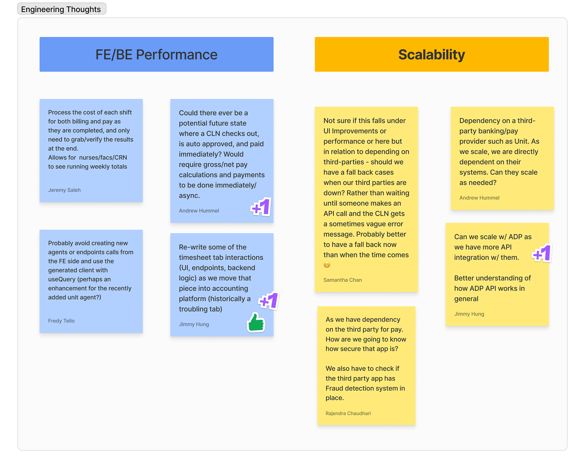
Engineering was consulted regarding the best integration approaches.

We consulted with engineering and other product staff before moving forward with Unit. Integration would be a complex task, but it was worth it for our users' convenience.
DEFining the scope
Integration meetings brought up a lot of new feature ideas for this overall product. Every meeting, each partner selling point had prompted internal talk about how to make Pay+ as successful as possible. We had a lot of C-suite support to really explore this feature.
To gather even more input, I recruited the broader product and design teams to contribute thoughts.

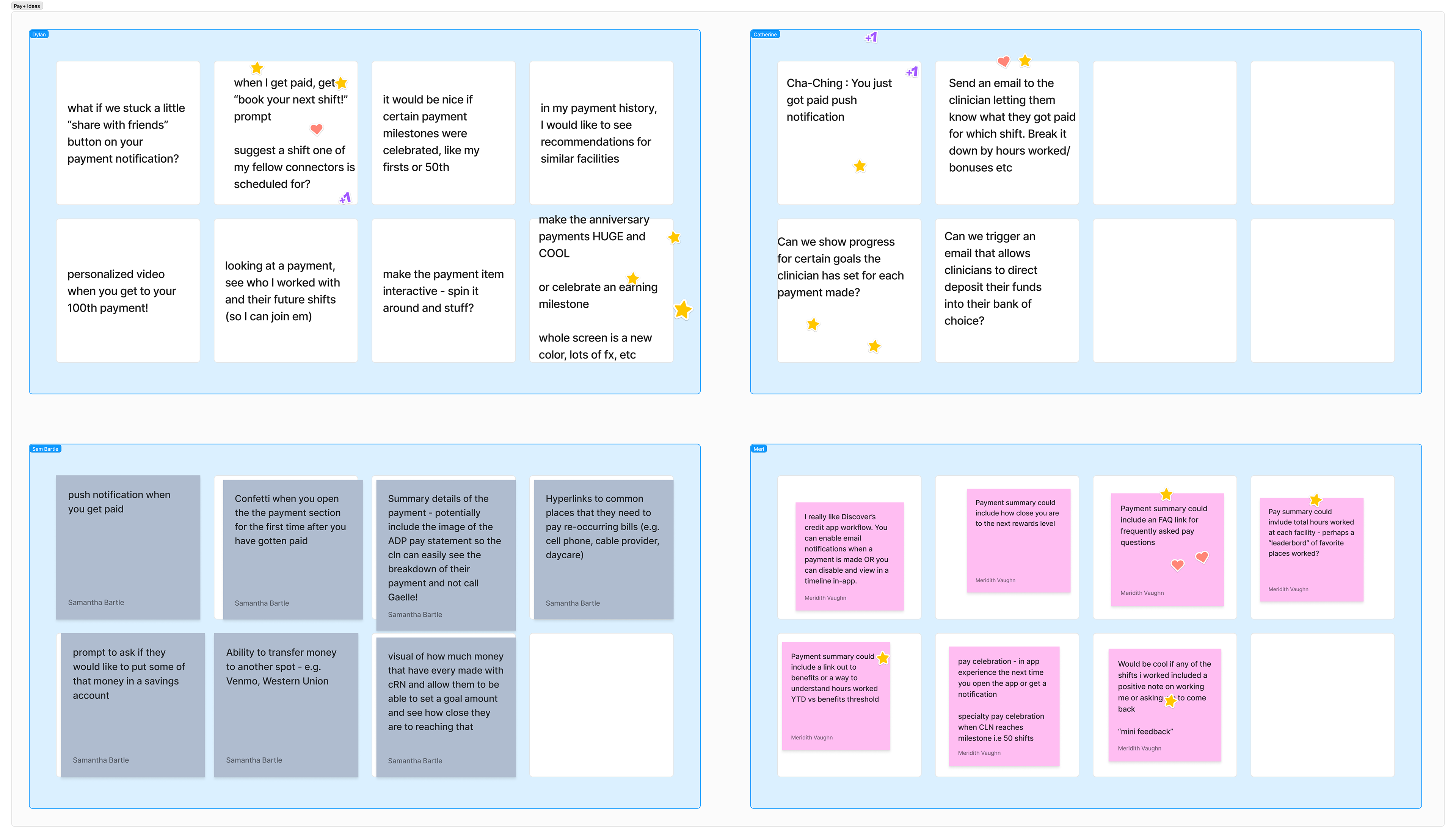
As part of an on-site, I led an ideation session with other product and payroll staff.

I contrasted this idea-gathering against the feedback of our engineering team to narrow down the actual scope of Pay+. We couldn't simply deliver on everything - even the basics were a lot.
To keep things reasonable, our MVP would focus on the basics - collecting paychecks, spending money via a Unit-provided card, and a few small support flows.
Initial Design
I leaned on existing banking design a great deal while drafting the first designs. While using the ConnectRN branding, I wanted the system to feel familiar to users. Frankly, it seemed unwise to experiment too much - given that this was a complex sub-system inside of an already complex application.

The core screens are familiar to anyone who has used a similar banking application.

The ConnectRN app actually had a small earnings tab already, with a basic FAQ. In the new designs, I made space for a third "Info" tab alongside the main "Balance" and "My Card" tabs. I saw value in preserving that old page as a familiar signpost during such a large update.
To further ensure successful adoption, I created an almost too-bold notification system for the initial signup process. Updating the pay process was a big commitment on our end, so I wanted to make sure our users signed up!

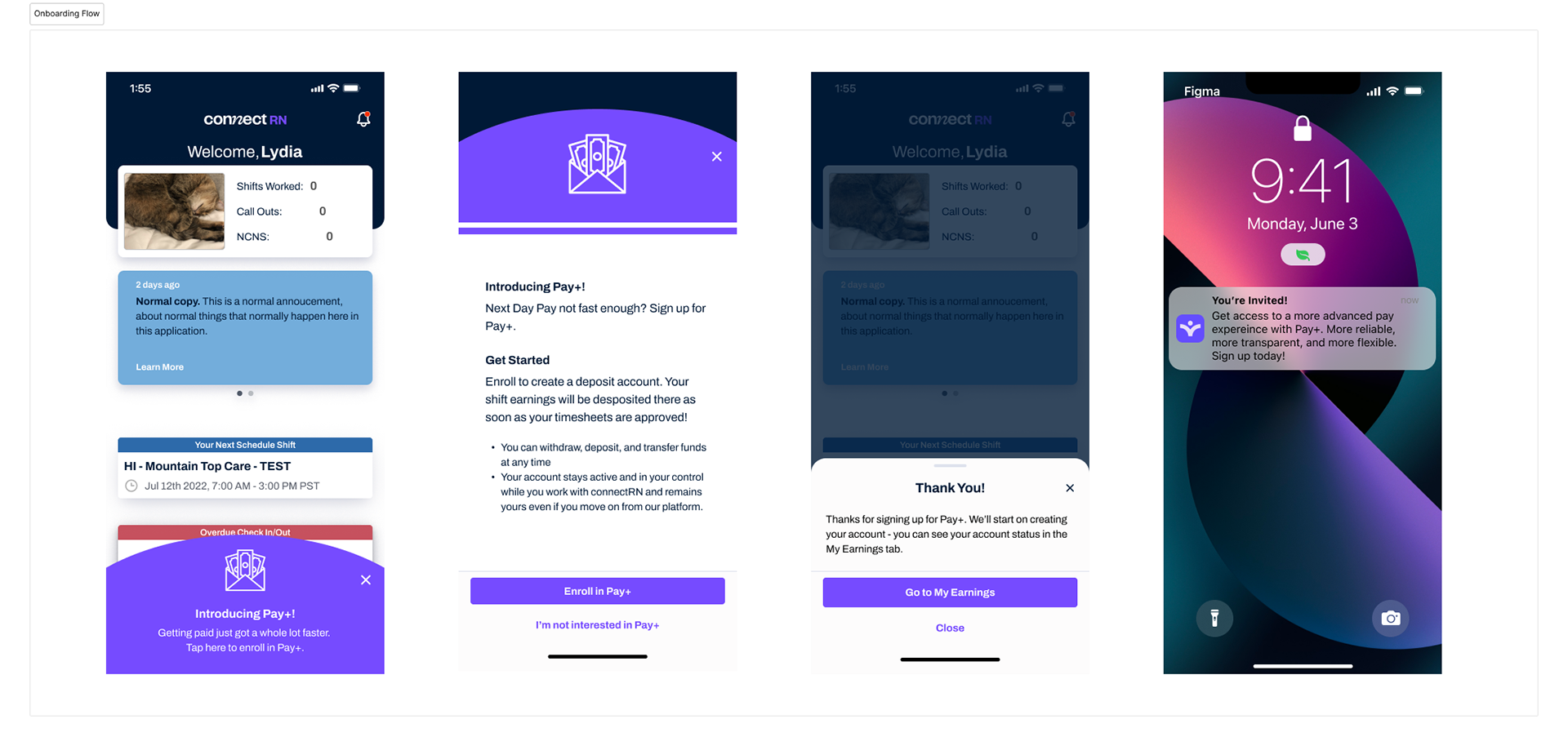
Bold notifications to underscore the importance of signing up.

Early Tests
Launching an entire banking application is a big task. We conducted early tests to make sure the feature was navigable.
We conducted user tests on several key flows - sign up, transferring, card management, and so on. While most users proceeded through the flows just fine, I noticed one or two getting caught up on our overlong signup process.
My PM was very interested in seeing if clinicians would prefer a digital or physical card. I could see, however, that explaining this situation was eating up a lot of user attention. In response to the tests, we got rid of the "digital vs physical" choice entirely to ensure a smoother initial experience.

The initial sign-up form was pretty long, so...

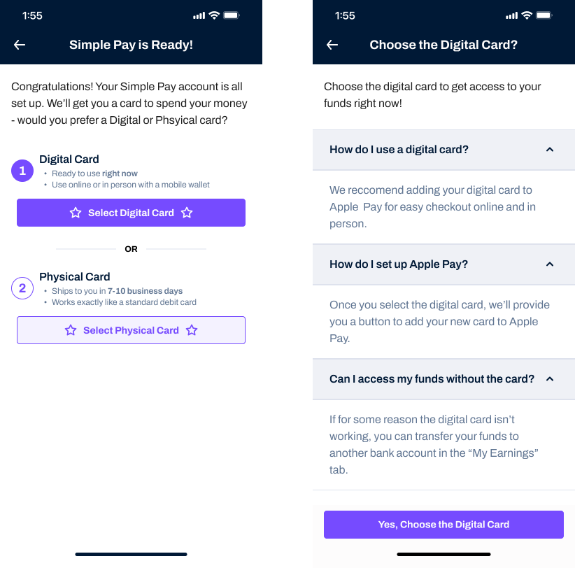
the "digital vs physical" choice and its explainers were cut.

Some of the more "edge case" flows also had higher user dropoff. Reliably, a fifth of the users would get lost or go in circles - while trying to replace their card, for instance.
To clarify the process, I designed a "steps" pattern. First, explain each step in the flow as simply as possible. Next, complete those steps, using the header to tie back to that initial plan visually.  

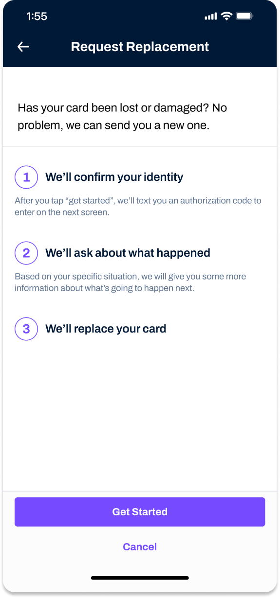
A preview makes each step of the flow clear...

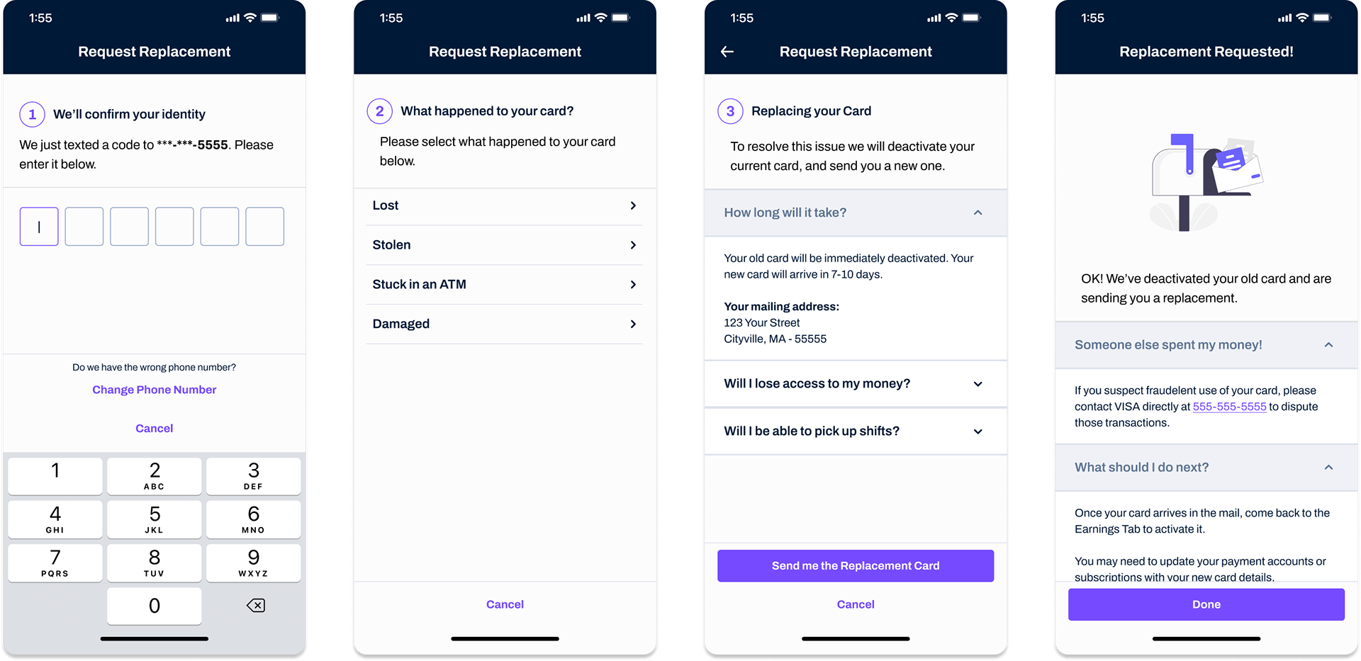
And then each step is repeated to reassure the user that they're advancing correctly.

This pattern proved successful, and I reused it for every similar flow. The added flow length from those "preview" screens was fine given the rarity of encountering these flows at all.
Future Features
While the Pay+ MVP had a set scope, I made some time to explore post-launch features. I believe this work is useful to help developers plan in the long term. These future features also kept company excitement for Pay+ high, once the MVP had gotten well past the public funding process.
One such "later" feature was celebration payments. For instance, if a clinician completed their one hundredth shift, we could create a special moment to reward that dedication.

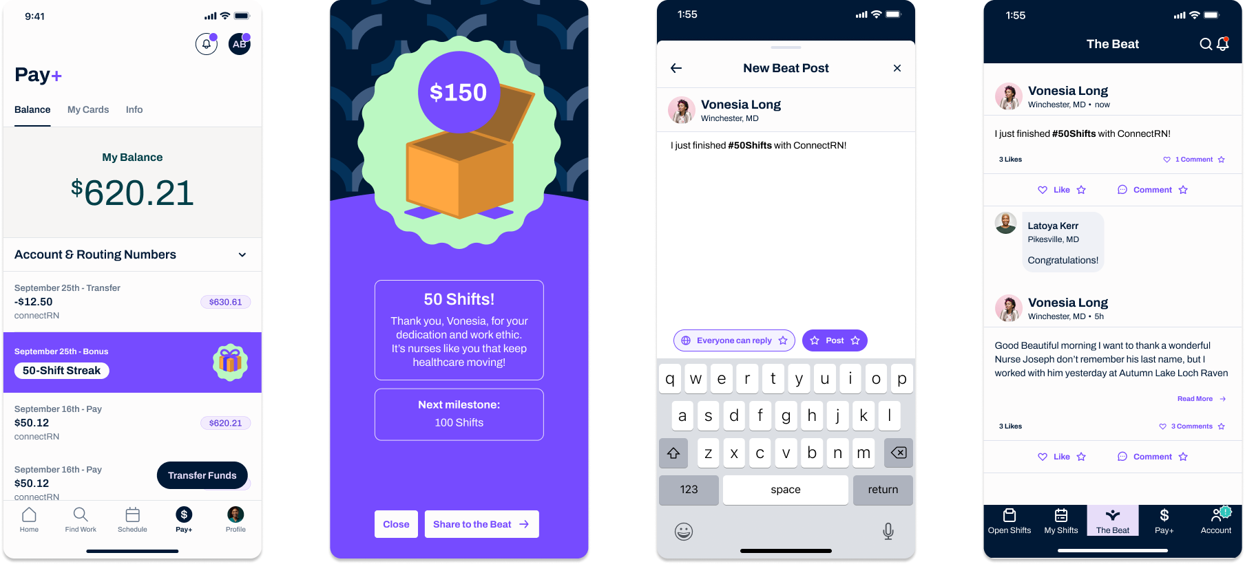
A "milestone payment" celebrates a clinician's time with ConnectRN.

A Detour into Payroll
While designing the mobile side of Pay+, I set aside time to work with the Payroll team to flesh out their process. Thankfully, I already had done quite a bit of research on this for a separate payroll project. 
I returned to my payroll documentation along with the payroll team, and we created the new flow payroll flow to handle the Pay+ disbursements.

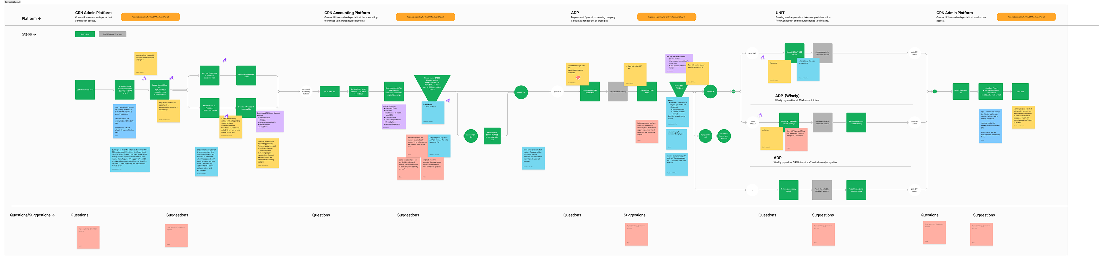
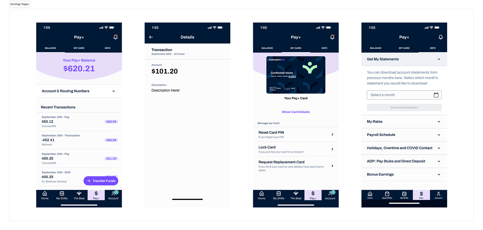
The complete payroll flow accounts both for older pay methods and the new addition of Unit.


The payroll wizard I had designed previously was already producing spreadsheets of total pay values to be uploaded to ADP. This flow also included a large set of safety checks (like looking for missing or duplicate payments) that we wanted to have for Pay+ as well.
I decided to take advantage of the wizard, and just redirect its output from ADP to a new "Unit Disbursal" page. This would be the moment that the Unit API came into play as well.

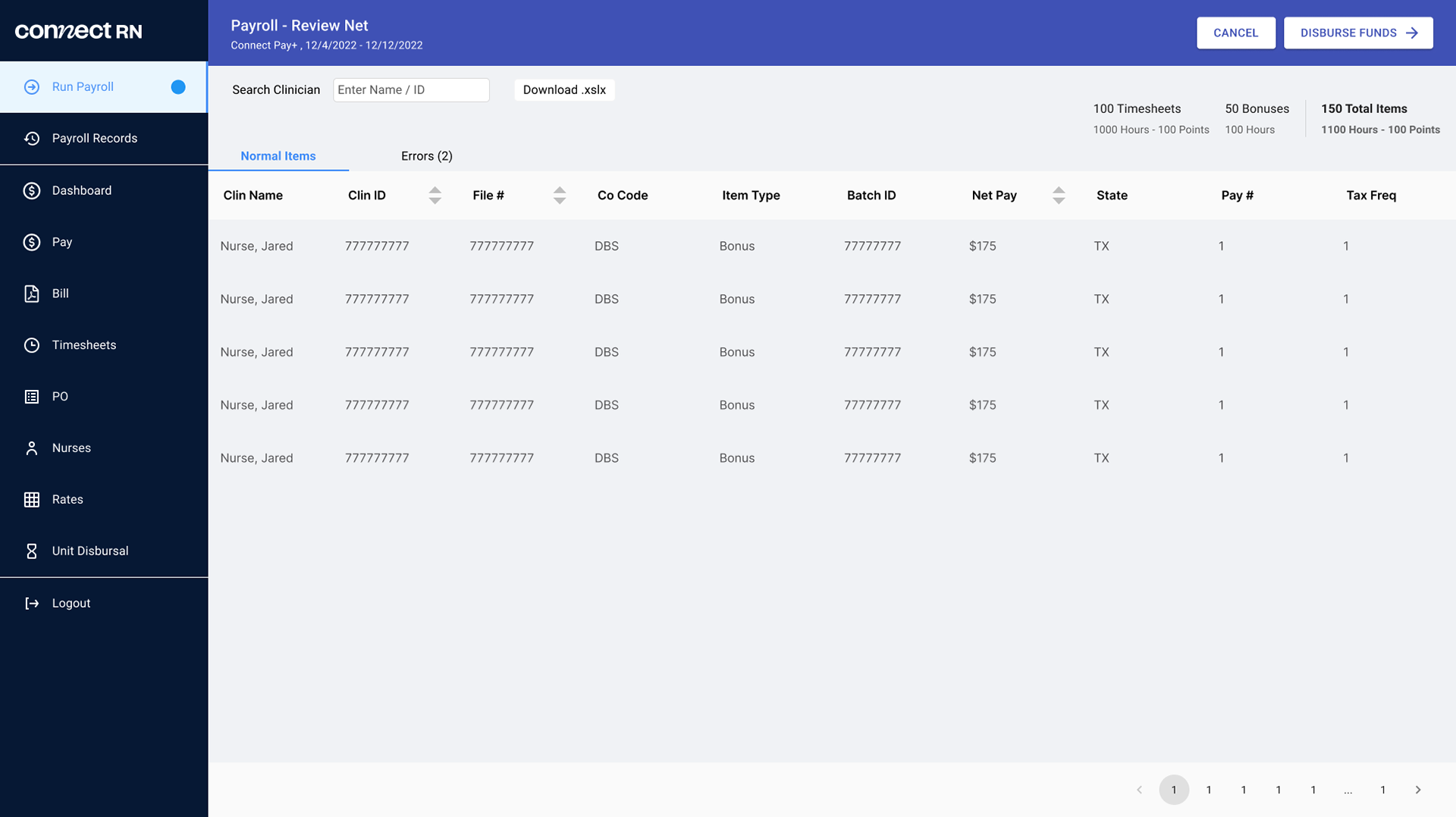
The payroll wizard produces a spreadsheet of clinician payments...

which are then disbursed by a new page linked to the Unit API.

This flow was unfortunately facilitated by a manual spreadsheet download / upload. To me this represented a potential site of tampering, by internal or external actors.
Solving this would mean the much much larger task of integrating with ADP (or replacing it) for tax calculation, so we did not force it here. Pay+ was a large enough project already.
A DETOUR INTO DESIGN SYSTEMS
While development was proceeding on Pay+, the company had hired Elona Jacquez, a design systems expert. By the time we were actually ready for launch, almost every component I originally used within Pay+ had been upgraded.
To ensure the best possible experience for clinicians, we took the time to reskin all of Pay+ to this new design system. I preserved the functionality and UX exactly. Most of the engineering work had been completed, so we couldn't rearrange elements very much.

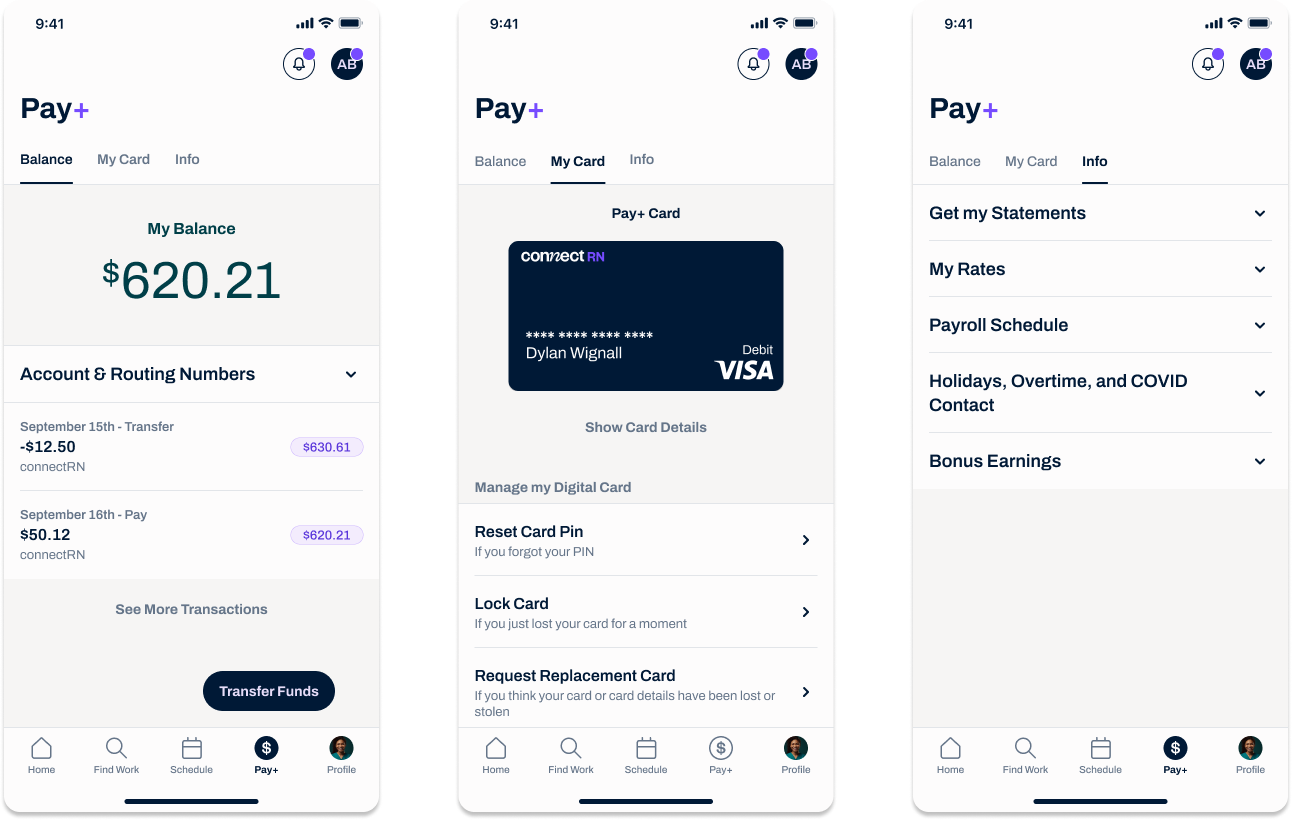
Final design pass, using fresh design system components.

Even with that restriction, the final designs were still a vast improvement. I created a simple priority plan to guide engineers on which screens to update first - the main management tabs first, and the rare problem-solving flows last.
FINAL PREPERATIONS
As development on Pay+ began to conclude, Matt created a final launch checklist. I continued to support my developers with small hotfixes, and created the actual payment card design - with feedback from marketing, of course.

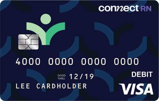
Final design for the payment card

Unfortunately, we ran into continual issues with this checklist as certain terms were negotiated with Unit. This was well outside my authority, and so I trusted Matt to resolve this in due course. In the meantime I contributed to other design efforts, such as the design system.
The Launch
After a little wrangling, ConnectRN was finally able to launch Pay+ to our clinicians. The feature was instantly popular, as seen by several key metrics. Within a single month of launch, we saw:
$661k
In Payments Issued
$150k
In Clinician Purchases
28% of the total user base was transferred over to the new model, clearly demonstrating the hunger for a more accelerated payment system. The payroll team was briefly overwhelmed by the sheer popularity of the new feature.
In addition, some of those clinicians had been inactive for two, three, or even four years. While we didn't set out to re-engage dormant clinicians, we were very pleased to see them again.
Final Thoughts
Working on Pay+ was a fantastic challenge. It was effectively like developing an app within another app - a repeat of my startup experience in a new context.
What this project really reinforces for me is the important of maintaining good relationships with all stakeholders involved. Our struggles with Unit delayed the project - but our solid contacts in the finance team accelerated it in turn.

You may also like

Back to Top