ABSTRACT
Blytzpay is a system that lets small businesses issue bills to unbanked customers. The business issues the bill to the user's account. The user can then pay these bills by visiting a big-box store and depositing money to their account when they check out.
Blytzpay contracted me via Outcode Software to redesign their phone application. Speed was crucial here given their very small budget - I was given six weeks to complete the project.
Setting out the Timeline
Given the tight schedule of my client, the absolutely first step was simply to define the timeline. In contract work, I find this very helpful to establish clear expectations and prevent a project from ballooning in scope.
The schedule I defined was broken into week-long steps:
Week One: Breaking Ground
Define the users and stakeholders with Blytzpay, as well as define common terms. I would also conduct a review of their existing design work, to better understand any issues to watch for.
Week Two: User Journeys
Diagram the main flow of the application. Given the slightly unorthodox feature, I specifically reserved more time for this to make sure we hammered out any confusion.
Week Three: First Design Pass
Produce a full set of unstyled screens for the mobile application. Doing this would prevent my clients from being distracted by the visual element. I wanted to ensure that feedback in this stage would be focused on the UX.
Week Four: Visual Pass
Upgrade all screens with proper visual flair, working off of Blytzpay's existing brand book.
With this schedule, I had two weeks for wiggle room and whatever quick testing I could perform.
Users and stakeholders
For a fairly small mobile app, Blytzpay would be dealing with several unique personas with different perspectives. I led multiple meetings with Blytzpay product staff to define each of these personas.
Customers
This person has the app installed on their phone, and is unbanked. They may be unable to easily secure a bank account, or untrusting of banks. In either case, preserving their trust is paramount - communication must always be clear.
Cashiers
This person is the link between the customer's funds and the app. Using a specific integration, they scan a bar code to enable the deposit of funds from a store purchase to the application. Ideally they need to interact with Blytzpay as little as possible - and the screens they see should be simple and professional.
VanillaDirect
VanillaDirect was the partner identified by Blytzpay to provide the API for account deposits. I wouldn't be interfacing with them directly, but would have to follow any integration guidelines they provided.
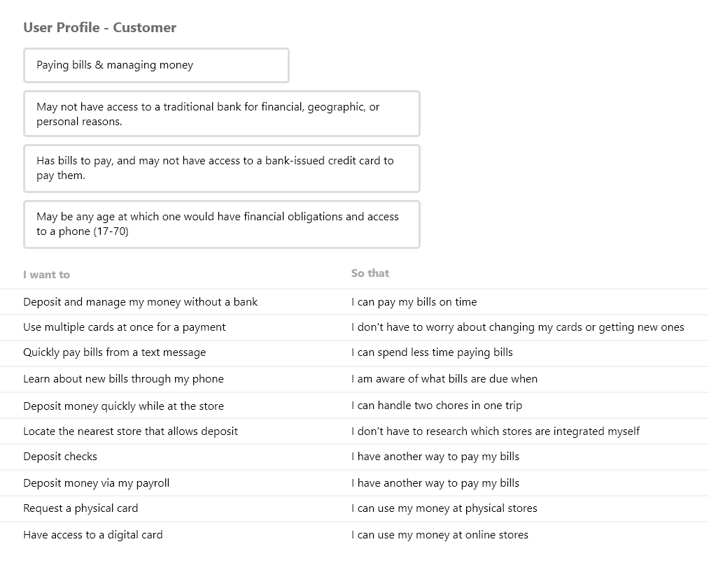
The customer definition document spells out the small feature set for the MVP.
Defining the Core Loop
With users defined, I completed a user flow document describing Blytzpay's depositing and bill pay flows. This guided my later design, and was a great platform for discussions with my client. Some clear priorities emerged from this user flow document:
The Customer is in Control
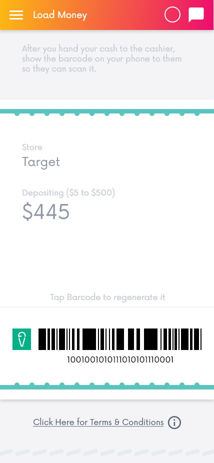
The phone app is the customer's connection their money, and their financial responsibilities. Early on, we thought the customer could simply hand their phone to the cashier to complete the deposit - but on reflection, that would likely make the customer very nervous about their finances.
Making a long-distance scannable barcode became even more of a priority.
The Reward should be Clear
Since the flow is complex and stressful, the customer should feel rewarded at the end. We want to reassure them that their money is where it should be. Executing this properly will encourage them to keep using the system.
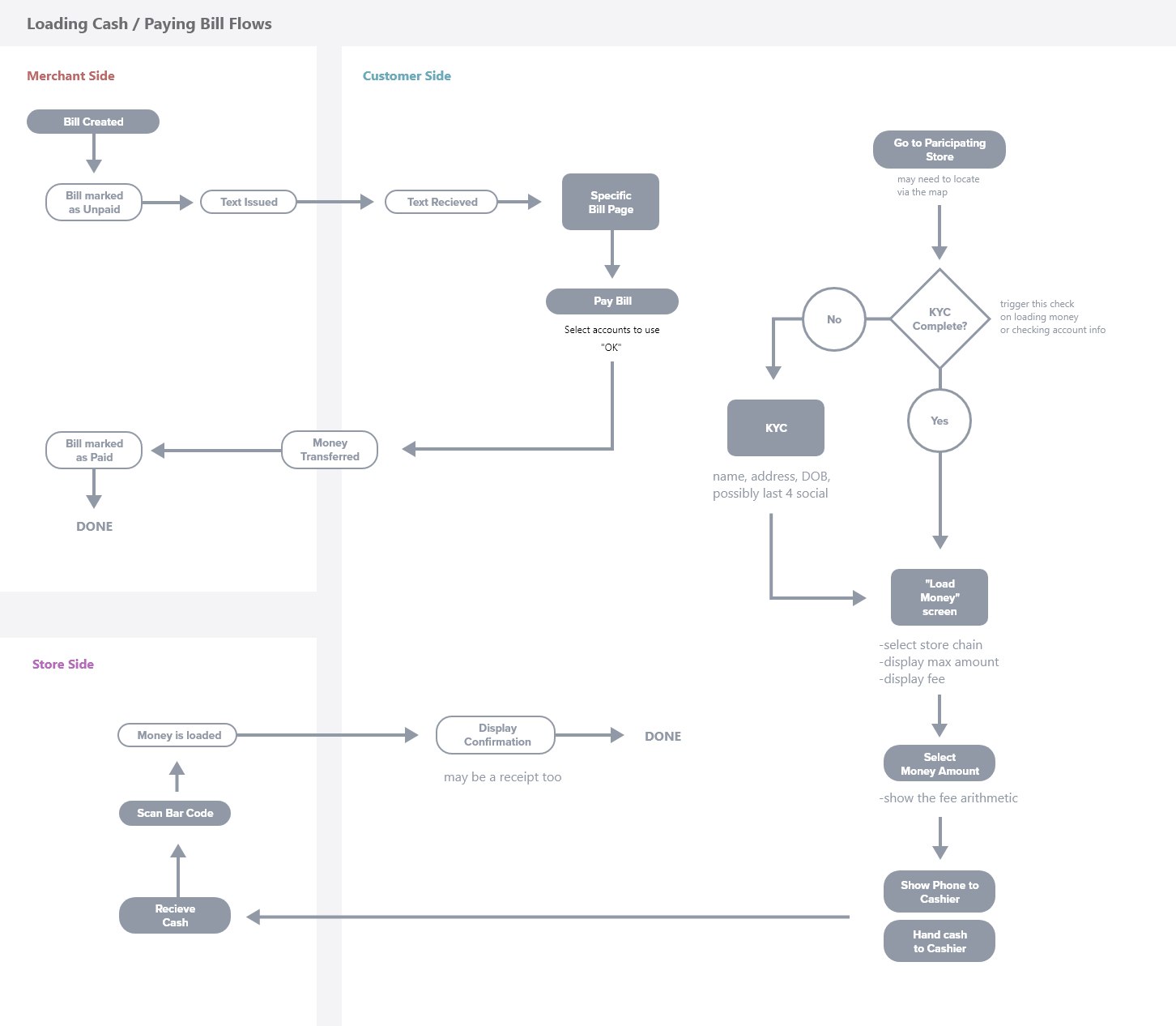
The flow document shows the different actors in the deposit and payment flows.
Initial UX Pass
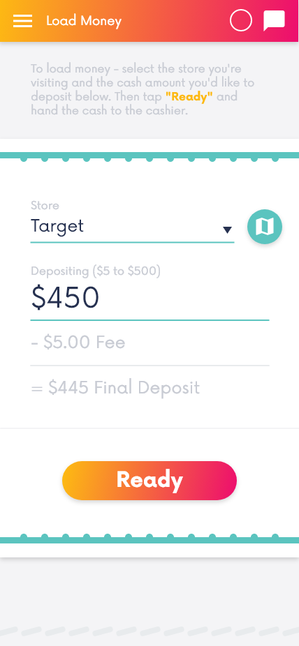
Following the established goals and guidelines, I produced a UX-focused set of screens. The main flow was clickable, to allow myself and my clients to review it together.
To meet our goals of clarity, I limited the number of clicks per screen as much as possible. Every user action provided some feedback - selecting a store revealed the deposit window, confirming the deposit showed the barcode, and then scanning the barcode showed a summary screen.
This might feel clunky to a more tech-savvy user, but for our wider audience accessibility was key.


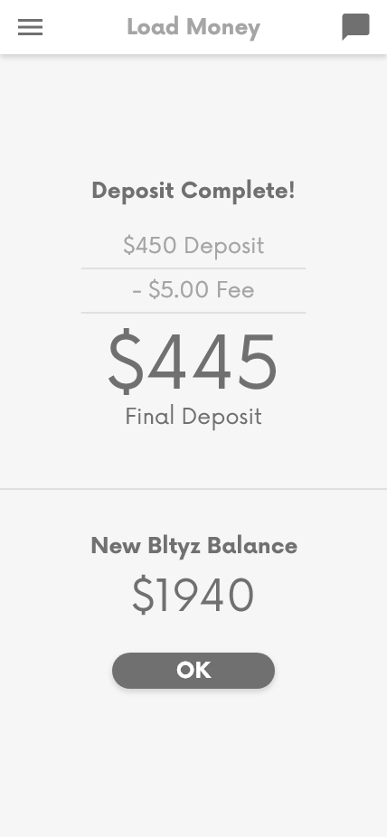
The simplicity of the main deposit makes it more legible to all users.
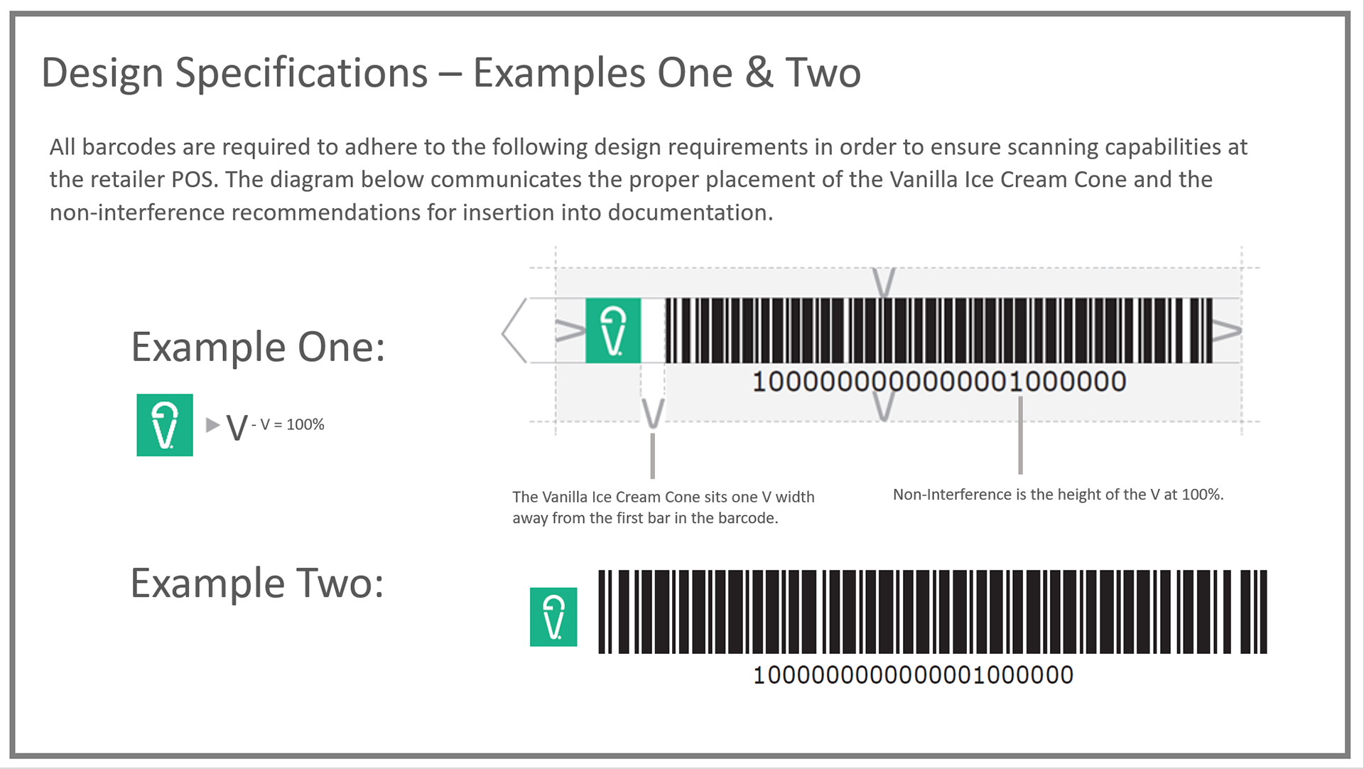
At this time we received guidelines from VanillaDirect for their barcode API. Thankfully their requirements were pretty lax, and easy to factor in during the final pass.
Polishing it Up
With the overall experience approved by Blytzpay, I went through with visual styling. Blytzpay wished to keep their brand colors, so I focused on their brighter red and orange. I wanted to create something engaging, to encourage repeated use.
I integrated some small textural additions as well, inspired by wallet stitching and perforated receipt tears. These small elements can add a lot of personality to an application with very little engineering lift.

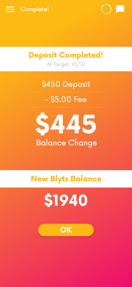
The visually styled deposit flow. The final screen pushes the "reward" element as much as possible, to help the customer feel accomplished.
Wrapping it up
This process went incredibly smoothly. We wrapped the final visual pass just as our time with the client ended. Instead of looking to test with external users, they asked me to provide some guidelines for future work on their web client, which needed a great deal of attention.
Overall, Blytzpay was quite happy with my performance. They were keen to work with us again after they secured further funding. Unfortunately, by that time I had moved on to my next role at ConnectRN. Still, I am quite proud of the stable design foundation I left them with this project.
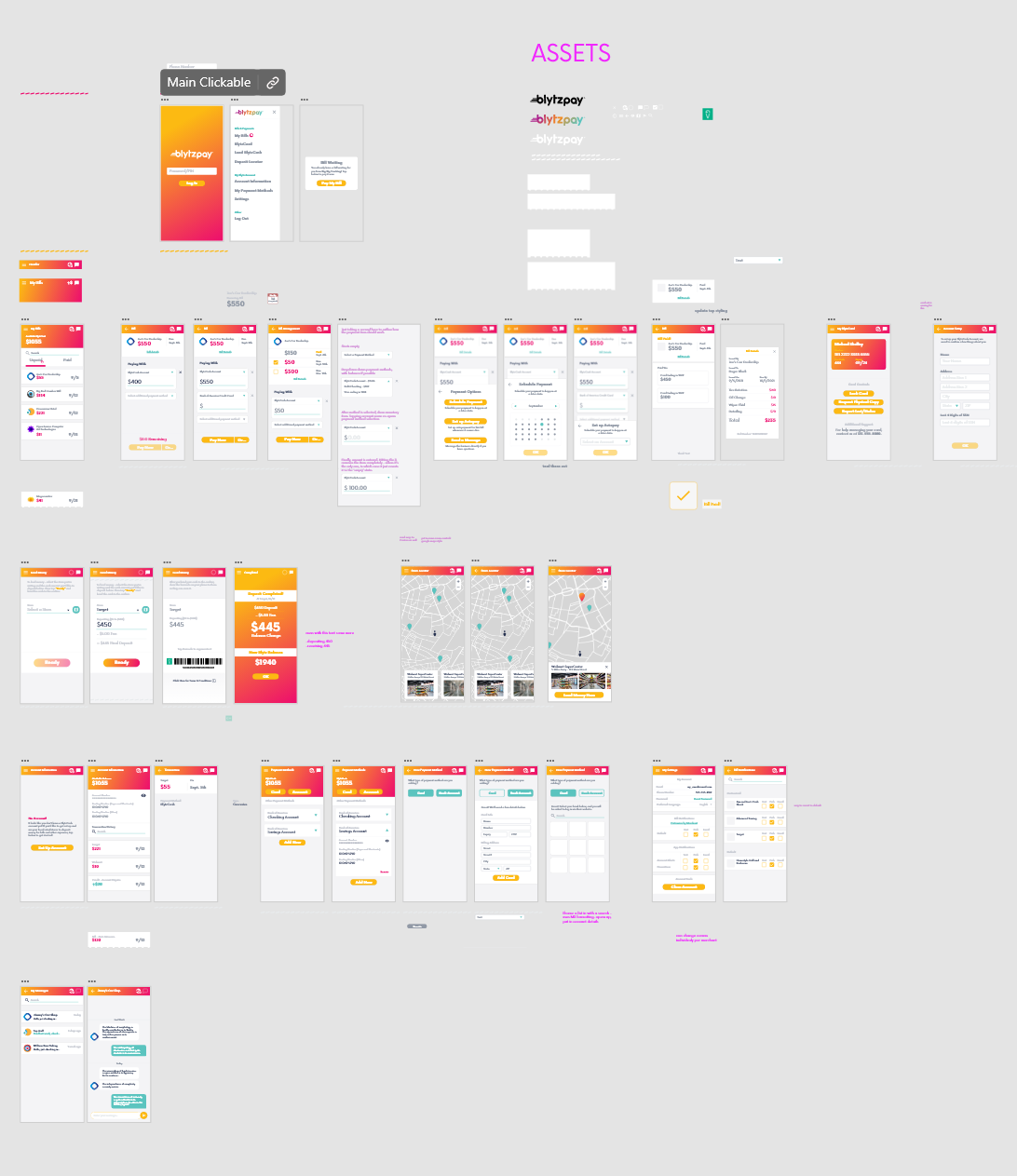
The completed design document includes the main deposit flow, multiple support features, and a few design components.